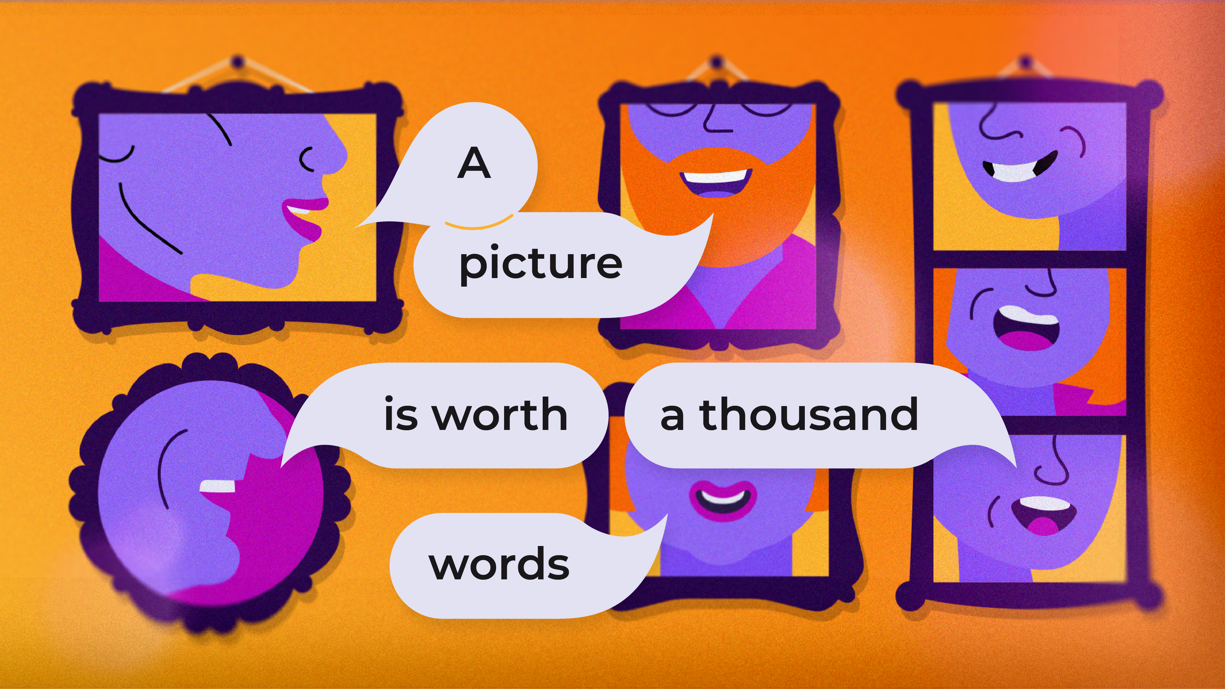
A picture is worth a thousand words
 Luke-Matthew Iveson
 ‘A picture is worth a thousand words’
An adage that resonates with me on a personal level. As a visual learner, and someone who is dyslexic and dyspraxic, I navigate many things through imagery and visuals. Photography plays an important role in how we perceive the world around us. The media has used photography to influence and portray what is considered ‘normal’, defining what representation should be. On the whole, we see visually appealing, white, (binary) gendered people, but is this really representing the world we live and work in? For me, this is where many campaigns and brand identities fall short – the ‘thousand words’ their photography screams are that of tokenism and misrepresentation. Their choice of photography often feels like a tick-box exercise.
There have been some good examples that aim to drive authentic representation, like the SS18 campaign by River Island (a UK fashion retailer). As a fashion brand, you expect their campaigns to have beautiful models to sell their fashion (and it did), but their model choice included visible disabilities, queer representation, ethnic diversity – it pushed beauty standards. For an industry that still has a long way to go to break down beauty stereotypes, I felt this was a step in the right direction.
When it comes to illustrations, there’s an interesting article by Trace Byrd which explores how we can abstract the human form; playing with colour to represent diversity. They conclude that using abstract colours to represent skin tones (such as blue) is not a suitable way to address diverse representation: the human brain is prone to bias, therefore different shades of blue translate to us as different shades of white, rather than the broader spectrum of skin tones. In addition, using colours not traditionally associated with skin tones can become problematic, as it introduces potential contextual/cultural meanings of different colours.
For example, blue skin in some cultures can refer to gods – whereas in others, they could be seen as zombies or aliens.
Furthermore, blue people don’t exist (to my knowledge anyway) – it remains important to reflect society, but not to abstract people to the point of alienation. The point remains, with illustration you have the control to shift power hierarchies. You have the ability to change the narrative of your visuals, to reflect your own organisation and to drive representation – be it women in tech roles, ethnic diversity, the list goes on. So what is the best way to make use of the ‘thousand words’ photography – and other creative visuals – provide us?
Forty1 have recently undergone a makeover. Our brand refresh provided us with an opportunity to think about how the visuals we use reflect the people we impact and the diverse environments in which they work. Our goal was to convey enrichment, connecting to our purpose of ‘creating experiences that enrich working lives’. We had clear parameters, such as utilising stock imagery to find suitable images (a challenge in itself), but our Creative team took on the challenge and, in my opinion, delivered a suite of images that connect to our brand, avoid tokenism, and drive forward the need for more authentic representation.
Given the nature of the task, it was important not to tackle this as a tick-box exercise. Using keywords like ‘confident’ or ‘modern’ and keeping distant from filtering tools seemed the best approach to find authentic and compelling imagery. Certain stock providers were strong at visualising what a contemporary, diverse, and inclusive workplace should strive to look like. They told their own stories, had real human qualities and were rich in representation. It just meant looking for imagery that instilled a positive inclusive feeling, rather than solely concentrating on the gender, ethnicity, and other aspects of identity.
– Alex Davison, Junior Creative at The Creative Engagement Group
There is no quick fix in achieving authentic representation. It’s a journey and should constantly be reviewed and adapted; finding better ways to show representation and ensuring your evolving workforce is represented. With our new brand, we have made those first steps and will continue to ensure that we reflect those we impact visually. My advice is to critically review your photography: spend as much time on this as you would crafting the right words to convey your purpose, ambition, or key message – it would be a travesty to have beautifully crafted words tarnished by poor visual choices. Spend resource to explore the market, do your research and avoid ticking boxes. Don’t use that image of a person in a wheelchair ‘just because’ – think about why you should use it and what it conveys to your audience. Representation is important but there is a fine line between that and tokenism.
Do your homework
Look at what your competitors are doing. Who do you feel does this well and why?
Dedicate the resource
Spend time finding or creating the right visuals – don’t just invest in the words. Your visuals are most likely the first thing your audience will see.
Define the purpose
Think about what you want to convey – don’t use visuals that tick a box. Identify the missing pieces in terms of representation, connecting it back to your main theme or idea.
I want to reiterate that we are on the start of this journey. We are working hard to get this right and acknowledge that this road ahead is difficult, and we need to be accountable for our choices. So far this has been a really exciting and positive experience – as a consultant working within Diversity, Equity and Inclusion, I believe this is a challenge often overlooked and I’m really proud to work for an organisation that wants to invest in finding solutions. I’m interested in hearing how other brands and companies are tackling this challenge, so please feel free to reach out and open a dialogue. It’s important to share experiences and best practice to help have a positive impact on the world we live and work in.
